Project Statement:
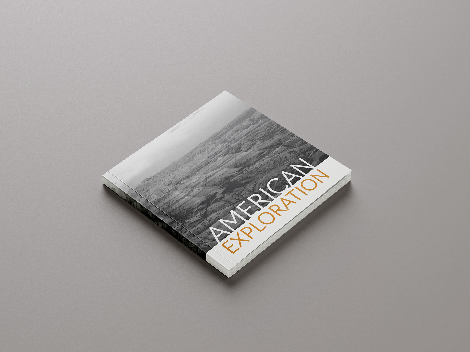
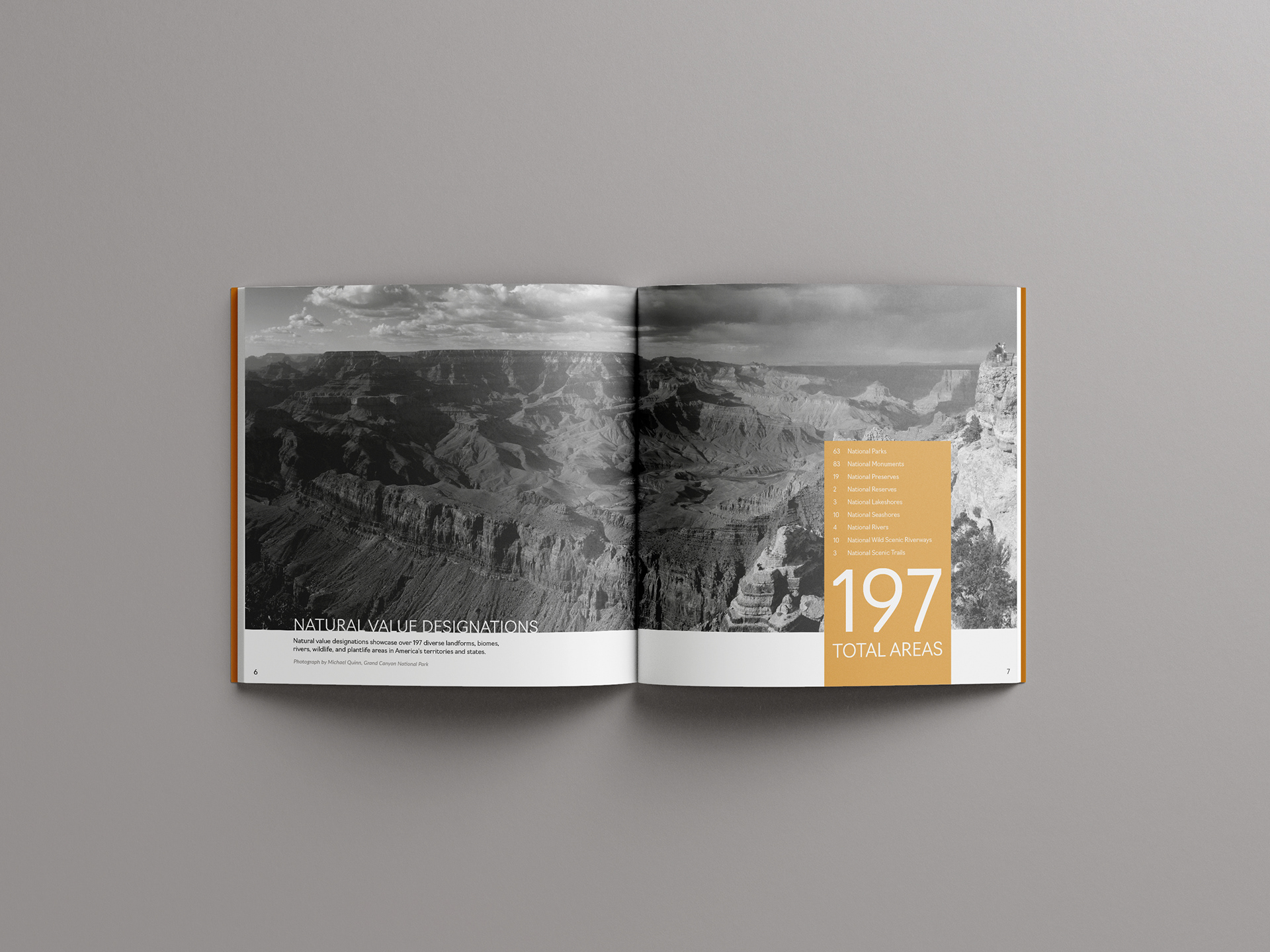
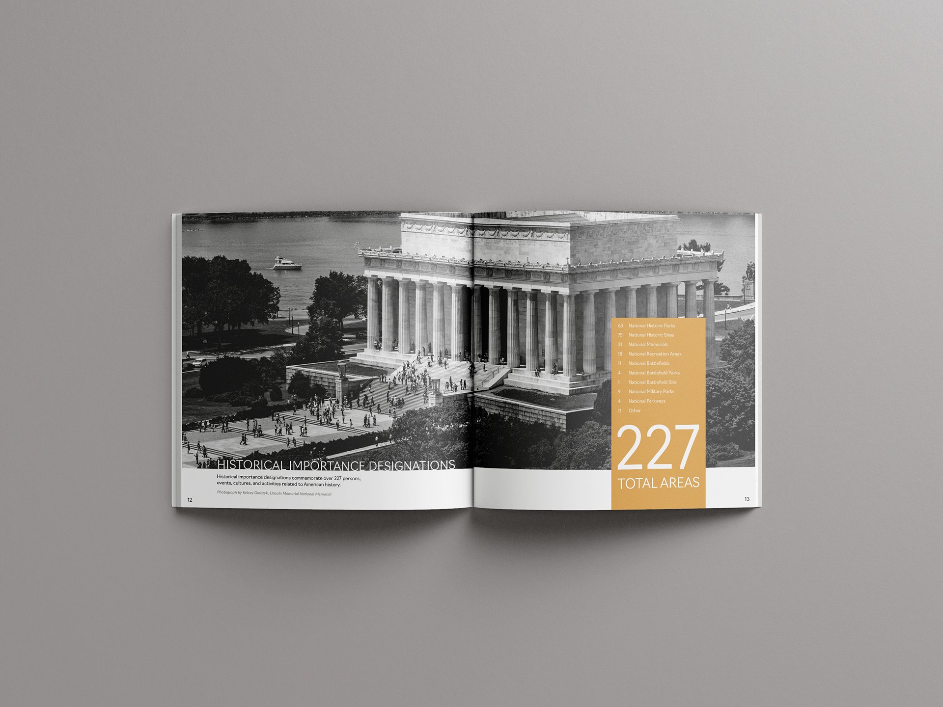
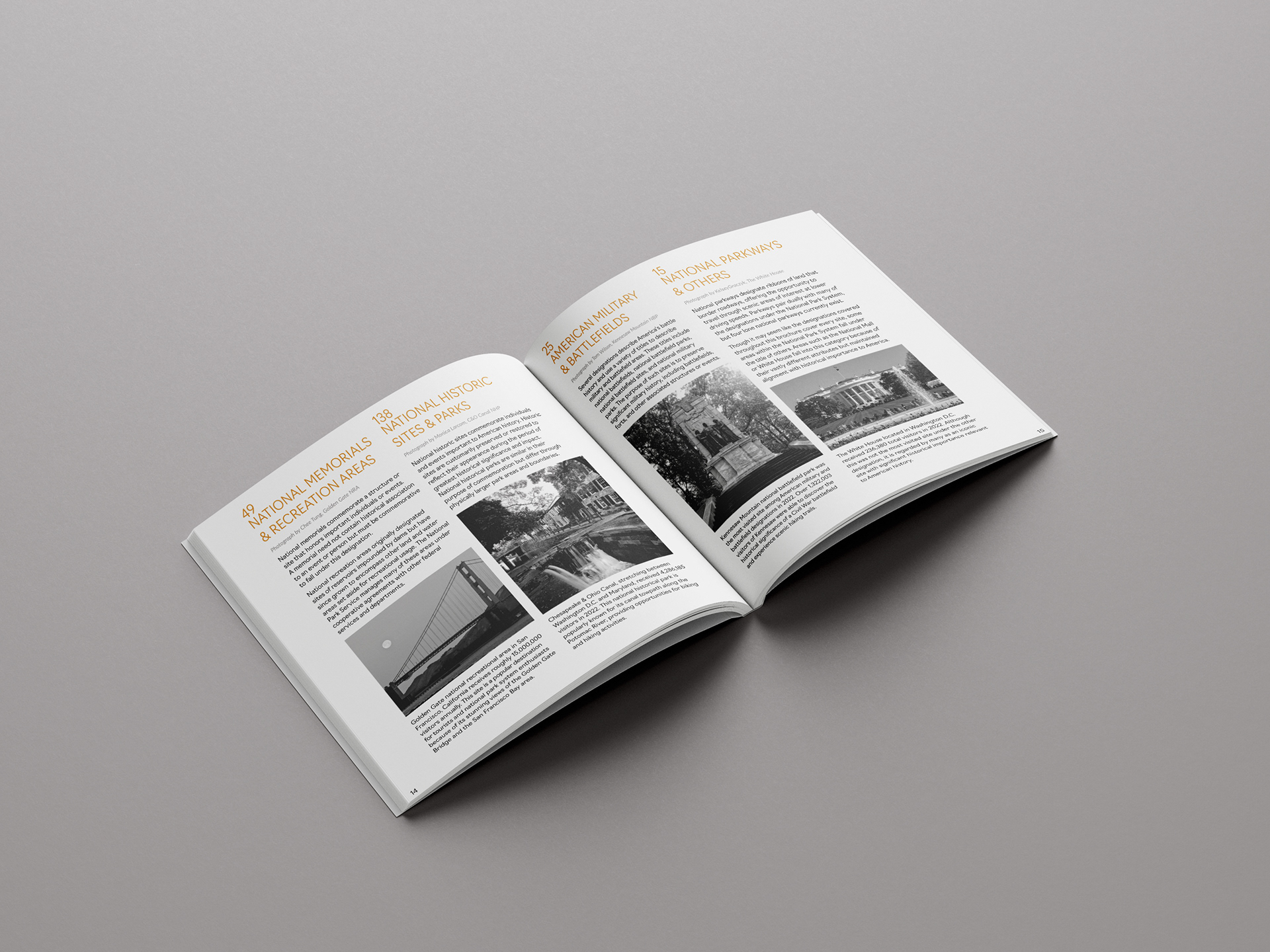
American Exploration is an educational brochure intended to elaborate on the current designations and classifications of the National Park System. Many explorers and outdoor enthusiasts fail to understand that the system encapsulates more than just national parks sites, which make up only 63 of the 424 total sites. This brochure provides clear messaging of terminology and identification of numerous park site opportunities present throughout America.
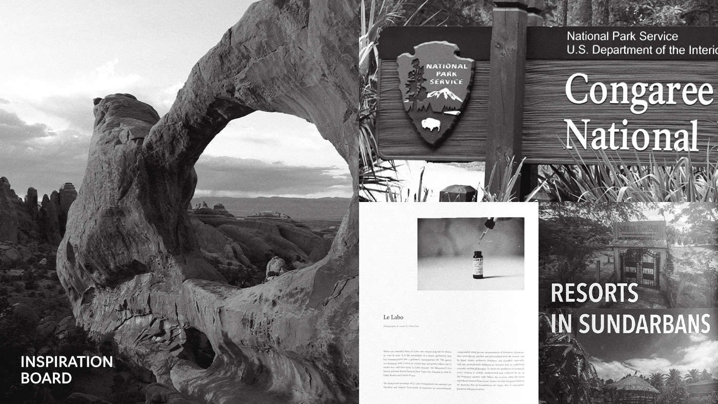
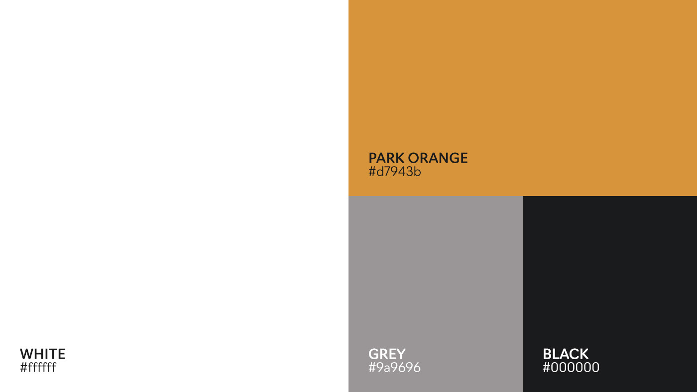
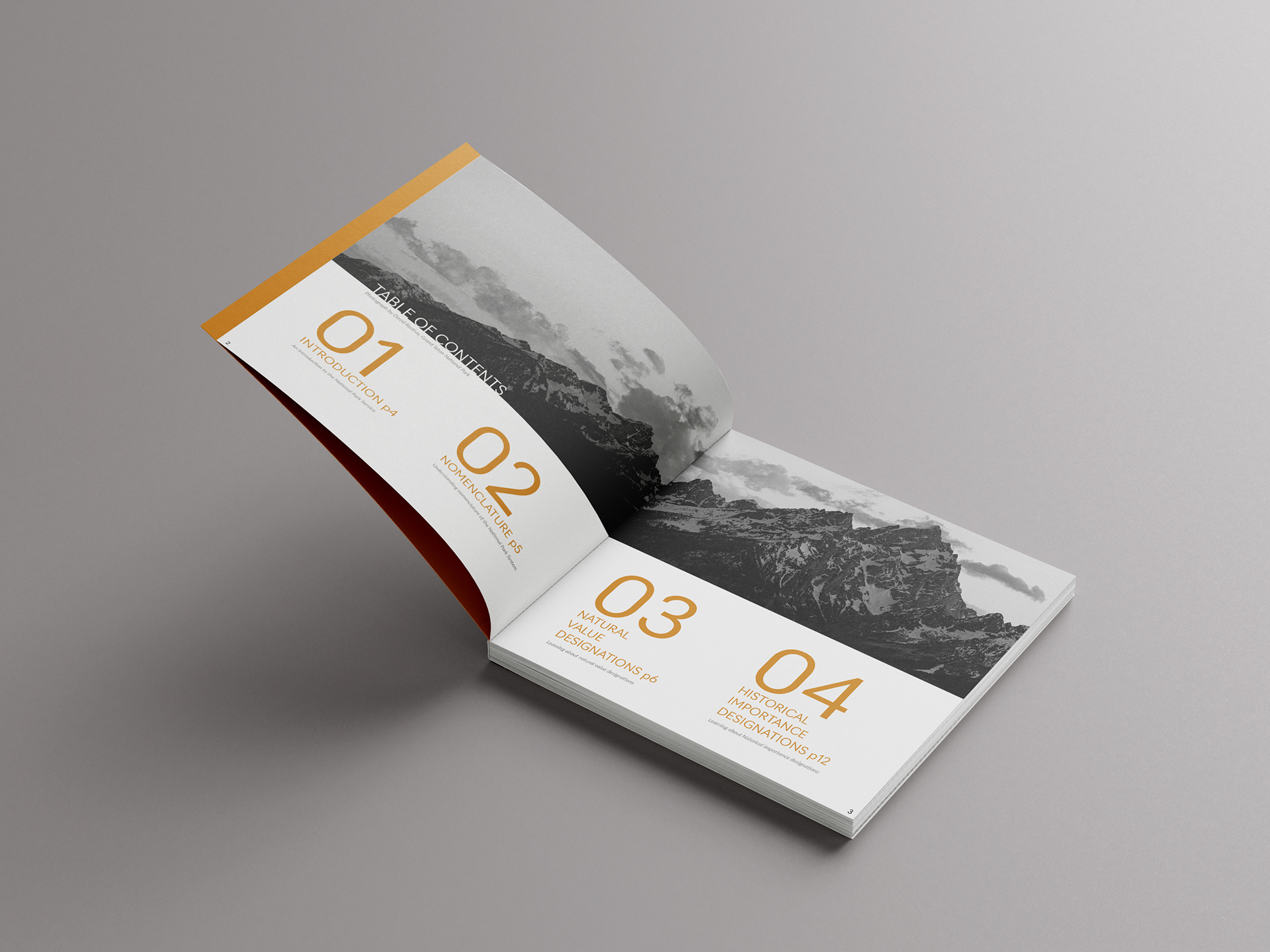
Completed as part of a comprehensive typography project for an educational course, this brochure paired a personal passion of outdoor exploration with student design studies. The exploration of pacing, layout, and imagery played an integral role in the finalized informational brochure. The creation process of this brochure was continuously refined to meet feedback and personal design standards. The consideration of monochromatic imagery was decided intentionally, for its lessened impact on the visual pull throughout the brochure. It was deemed essential that the copy written content was the most important substance, shown through hierarchical and vibrant orange color type design choices. All aspects of this brochure from copy to layout was designed personally, with only the photos being outsourced and sited to the appropriate photographer.
American Exploration is an educational brochure intended to elaborate on the current designations and classifications of the National Park System. Many explorers and outdoor enthusiasts fail to understand that the system encapsulates more than just national parks sites, which make up only 63 of the 424 total sites. This brochure provides clear messaging of terminology and identification of numerous park site opportunities present throughout America.
Completed as part of a comprehensive typography project for an educational course, this brochure paired a personal passion of outdoor exploration with student design studies. The exploration of pacing, layout, and imagery played an integral role in the finalized informational brochure. The creation process of this brochure was continuously refined to meet feedback and personal design standards. The consideration of monochromatic imagery was decided intentionally, for its lessened impact on the visual pull throughout the brochure. It was deemed essential that the copy written content was the most important substance, shown through hierarchical and vibrant orange color type design choices. All aspects of this brochure from copy to layout was designed personally, with only the photos being outsourced and sited to the appropriate photographer.