Project Statement:
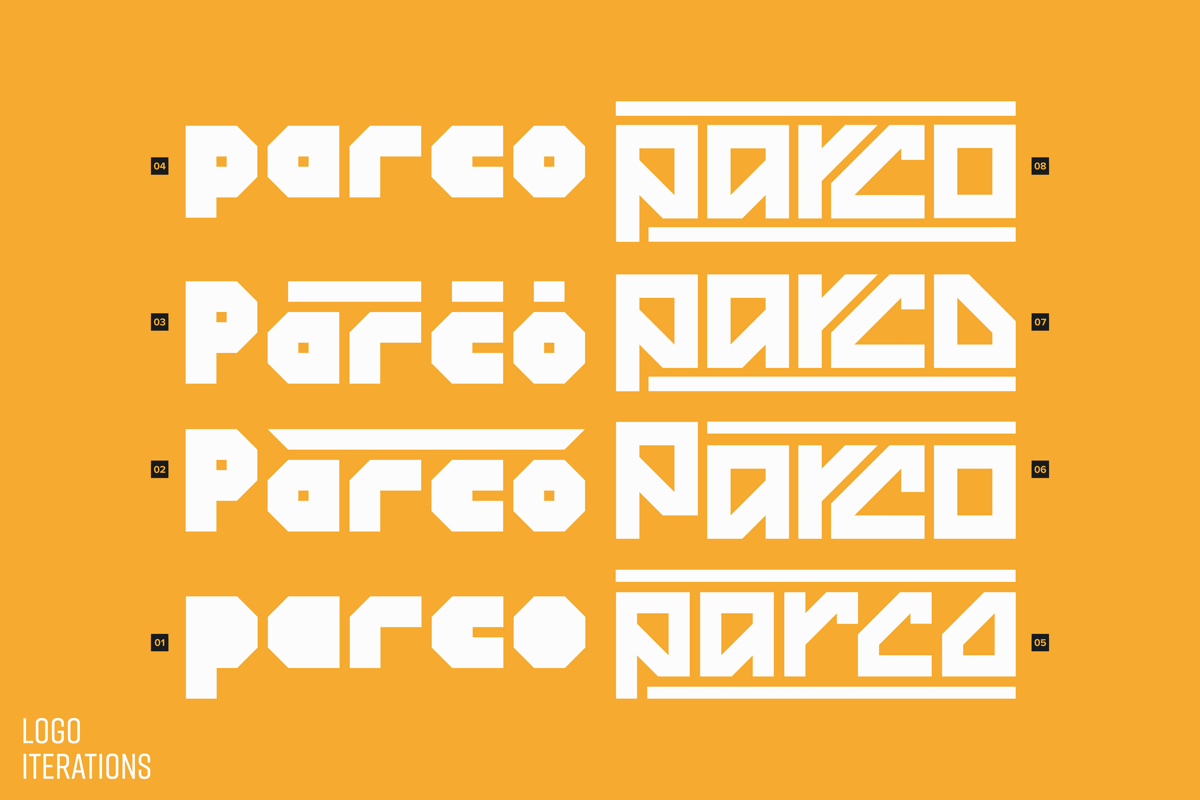
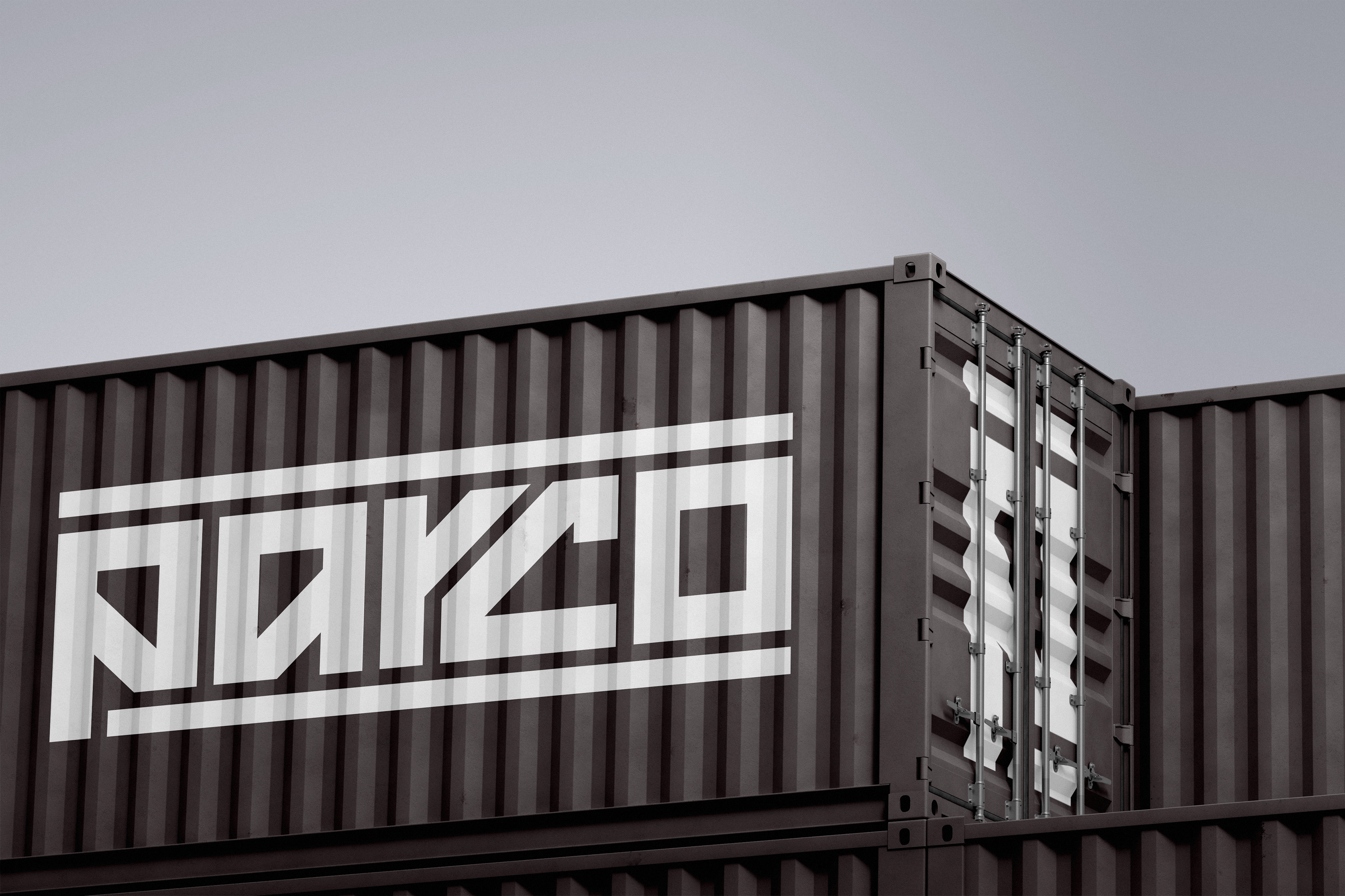
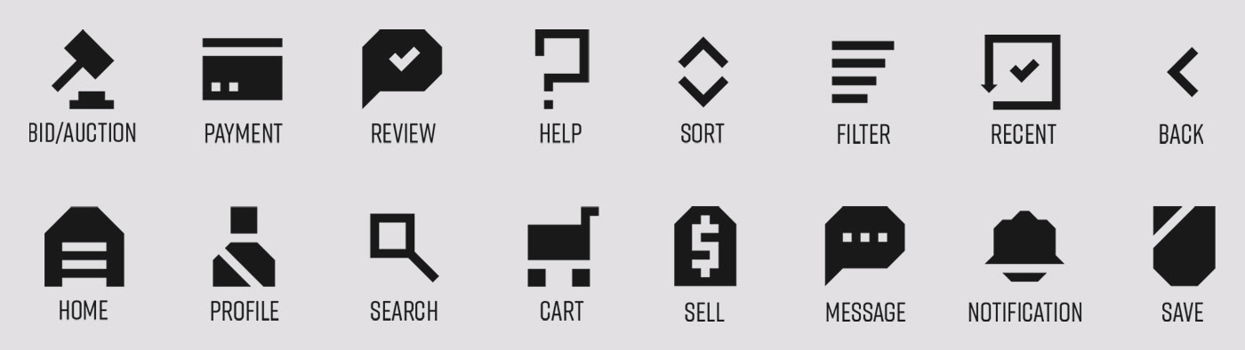
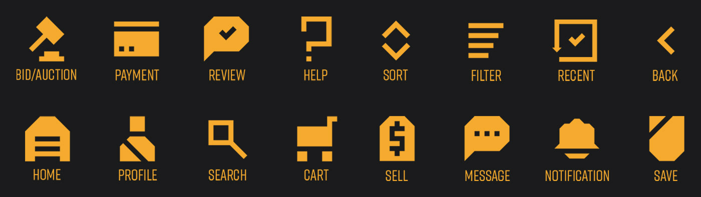
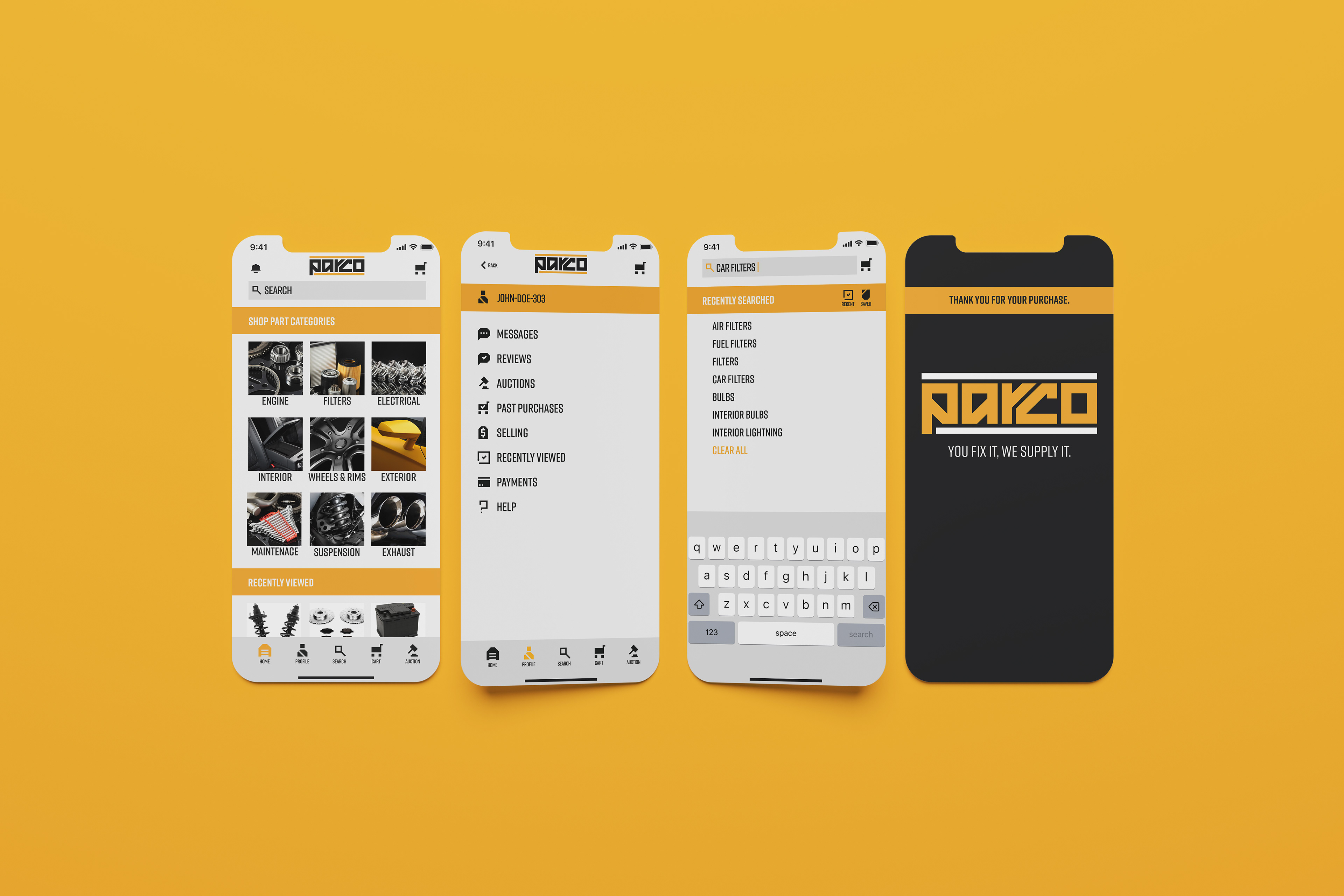
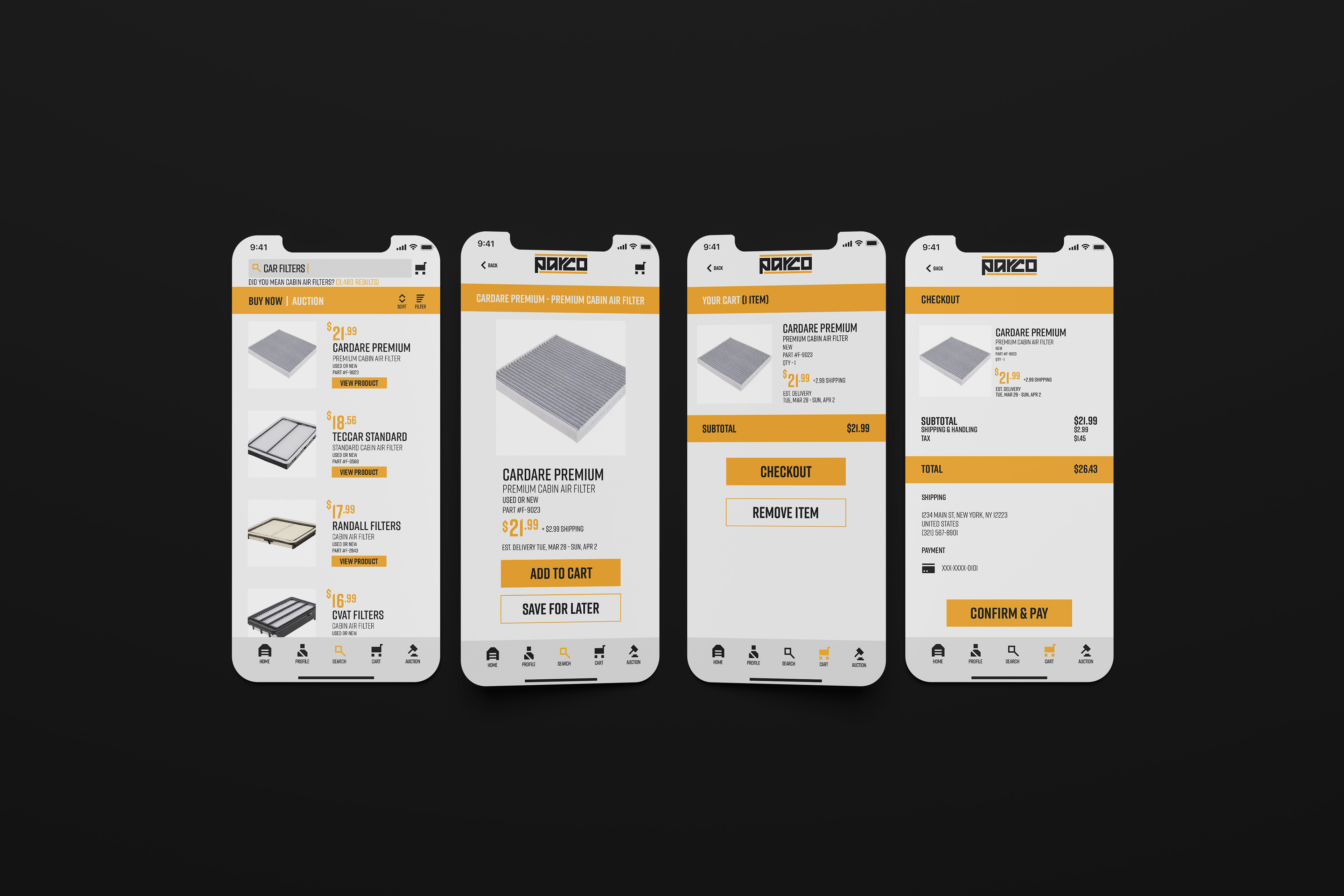
Tasked to create a smartphone app interface with a cohesive logotype and icon set, Parco was created, centering around the automotive parts industry. Acting as an online marketplace for car parts, the creation of Parco originated from the combination of the words part and company. An angular logotype was created to represent reliability, simplicity, and sophistication. Additional cohesive icons were created using the same angular concept to be utilized throughout the app interface design.
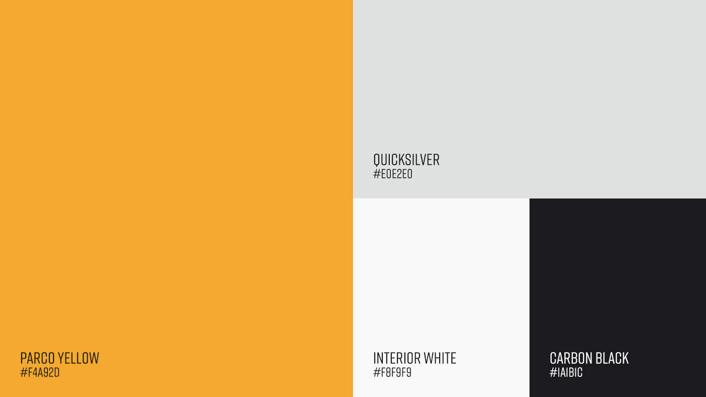
The logotype, icons, and interface utilize four prominent colors to further enhance the Parco apps relation to the automotive industry. Black and grey were used for their prominence in part colors, while yellow and white were utilized to convey energy and reliability. Content writing and design choices influenced by persona creations further enhanced the finalized user experience. Parco as a whole embodies the idea of a reliable and bold automotive parts marketplace.
Tasked to create a smartphone app interface with a cohesive logotype and icon set, Parco was created, centering around the automotive parts industry. Acting as an online marketplace for car parts, the creation of Parco originated from the combination of the words part and company. An angular logotype was created to represent reliability, simplicity, and sophistication. Additional cohesive icons were created using the same angular concept to be utilized throughout the app interface design.
The logotype, icons, and interface utilize four prominent colors to further enhance the Parco apps relation to the automotive industry. Black and grey were used for their prominence in part colors, while yellow and white were utilized to convey energy and reliability. Content writing and design choices influenced by persona creations further enhanced the finalized user experience. Parco as a whole embodies the idea of a reliable and bold automotive parts marketplace.


.
.